There are some things I like about the design and then there are some things I don't like as much. Oh oops silly me I need to show you Mr. Puig don't I.
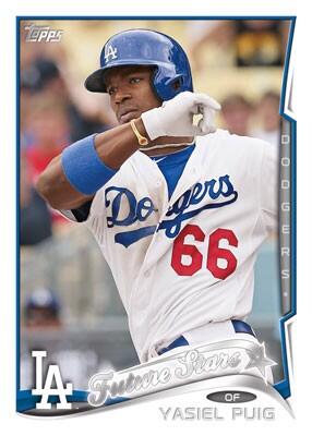
First off, this picture obviously (if Topps has any common sense) shows that Puig's rookie card will not debut on the 2013 design. *Gasp. I know most of you are saying that he already has a rookie card in 2013 Gypsy Queen and Allen & Ginter. Yet, he does not have one in Flagship, so it should be interesting what Topps does with this.
Secondly, this is quite a crowded design. Logo, Position, Name, Team Name, etc. There's a lot going on here. That maybe a good thing in some people's point of view, but I don't really see it as a good thing. Too many things happening for me. Just my point of view.
Now for the bright sides of the design.
I don't know about you guys, but I fell like Topps has been at sea for quite a while now. Lets think back. 2012: Surfboard. 2013: Sea Turtle. 2014: Wave. I feel like next year we'll have the wave going on. Looks pretty cool though.
Another significant thing about this design is it feel a bit more modern. We aren't stuck in these boxes anymore. The edge on the right side creates this perception occur. I like it. They could almost make a die-cut out of every base card as an insert of something. That would be unique.
I don't know about you guys, but it looks pretty cool. Can't wait to see how it looks in my hands.
Thanks for reading. Have a great time blogging everybody! :)
It seems like they're designing for the parallels a lot these days. Still, I do like it.
ReplyDeleteI don't think I'm a fan of this one. The team name thing on the side seems reminiscent of some of the later Upper Deck designs. I like the team logo on the bottom left, why do they need to go and put the team name on the side as well? I DO like it when they can include the position on the card, as well as use the team colors in the design, so they get points there, at least. Still, I prefer '11 and '13 designs much more than '12 and '14. But maybe it'll grow on me. We'll see.
ReplyDelete